

These charts are part of an Economist article, which picks up a few of the data points. They show to what extent physical impairments affect people.
An obvious oddity is that the bars are unsorted. Why would that be? When we look at the categories, we realize that there are two kinds of them:
A sequence of age intervals and a few world regions.
The age distribution I wouldn’t sort indeed. This part of each diagram is rather a vertical histogram. The regional values on the other hand I would absolutely sort into a top-to-bottom list. We have two different angles here from which we look at the same entity of respondents. To hold these two angles apart graphically I would use two charts on either side, not one. Plus “All” as a third one.
Then the design of the bars needs fixing. The older values have one color, the newer values are split into that same color and red. This fragmentary design with double meaning for one of the colors makes it really hard to read. Rather go for something clear.

In this half-way draft I have fixed the bar design and separated the category groups from each other, albeit without sorting at this point. But we can already see that life is getting more painful the older we get. Also, I have replaced the redundant horizontal grid lines with vertical ones, which give an idea of the actual numbers.
Talking about numbers – that‘s where further issues lie.
One hilarious thing I noticed as I transferred the data from the original is: Not ten of those yellow pills equal 0.10 on the x-axis – nine do already. Imagine that. Happy calculating. My goodness … (So, if for some reason you ever use a symbol signature to represent values, use handy relations, like decimals or halves)
The other problem is on the ‘Years affected” scale, too. How much is the 0.15-fold of a year? Right. When one breaks down time like this, then people will drift off calculating. Months and days is how we subdivide a year, not decimals. Weeks may also work at times, but for this I will use days.
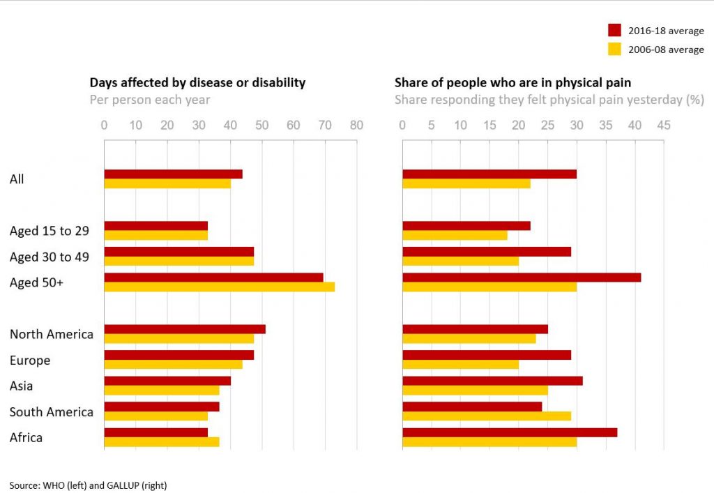
Finally including sorting: First, I have swapped the bar pairs into a natural order with the latest values on top followed by older ones. Second, I have sorted the regions by „years affected“ on the left. Interestingly, the „share of people in pain“ values are not consistent with that order. This is an additional information, which was invisible before sorting.
Altogether, this was a rather cryptic pair of charts due to lacking structure, design clarity and measurement. I have fixed all this, and now you can take information from there instead of ‘painfully’ extracting it.
Side note: Still unclear to me remains what ‘All’ is. ‘Days affected’ has increased for them, but across the age groups it has rather decreased. So ‘All’ cannot mean all participants. This calls for a clear definition of terms, otherwise credibility suffers.