

Basically, a table is a concept noted for creating clarity, and very much in use because of that. There are, however, ways to eliminate this effect, as this example shows.
First, varying color shades in the background: This grey, that grey, even black, are keeping us busy with figuring out whether all that means anything. It doesn’t – so, that’s why all that grey paint should better not be there at all. The other issue with this chart is the design of the vertical structure, which should be more helpful.
Normal table
After removing the paint, we adjust the columns in a way that favors readers’ comprehension.
- Process names are shown once, not 4 times
- Sub-processes are all left-aligned, not requiring a zig-zag read
- Scores lead to their evaluation marker, not the other way round, and not with a distance that makes them look unrelated
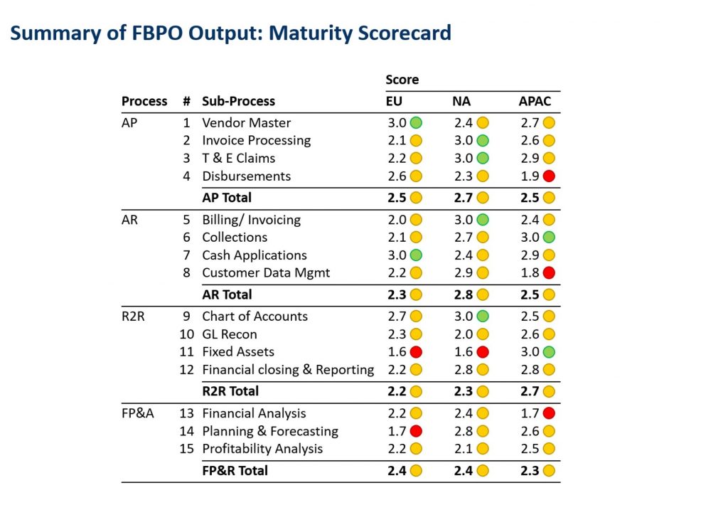
Talking about evaluation: The logic of traffic lights is very common for concepts like good/neutral/bad. In some cases they are self-explaining. In this case, however, it would help to explain their meaning in a legend. Firstly, to make just that more precise, e.g., as “process works always/sometimes/rarely”, “process mature/tested/improvised” or “profitable/cost-effective/cost-intensive”. Secondly, to assign value ranges to each traffic light color. This would add context and credibility to the evaluation
Chart with a title
Finally, a title rules what to think of the following evaluations. The gaps between the columns are a little bigger again, otherwise the table looks squeezed. The totals for each process we have shifted up to the beginning of each block. This straightens another bothering zigzag read, which had occurred between each process name and related score total. This helps especially those who skip reading the details.

Now, there appears to be a contradiction regarding which order of items works best. Before, it was logical to put the scores first, and the resulting evaluation markers second. Now it is more practical to start with the totals, and continue with the components from which they are made.
We can see this as an example, that an optimal visual arrangement is not the result of strict rules to be followed, but rather of balancing best practices on a case-by-case basis. This chart at least, we have freed from distracting and confusing design meanders, and turned it into a readable communication medium.