

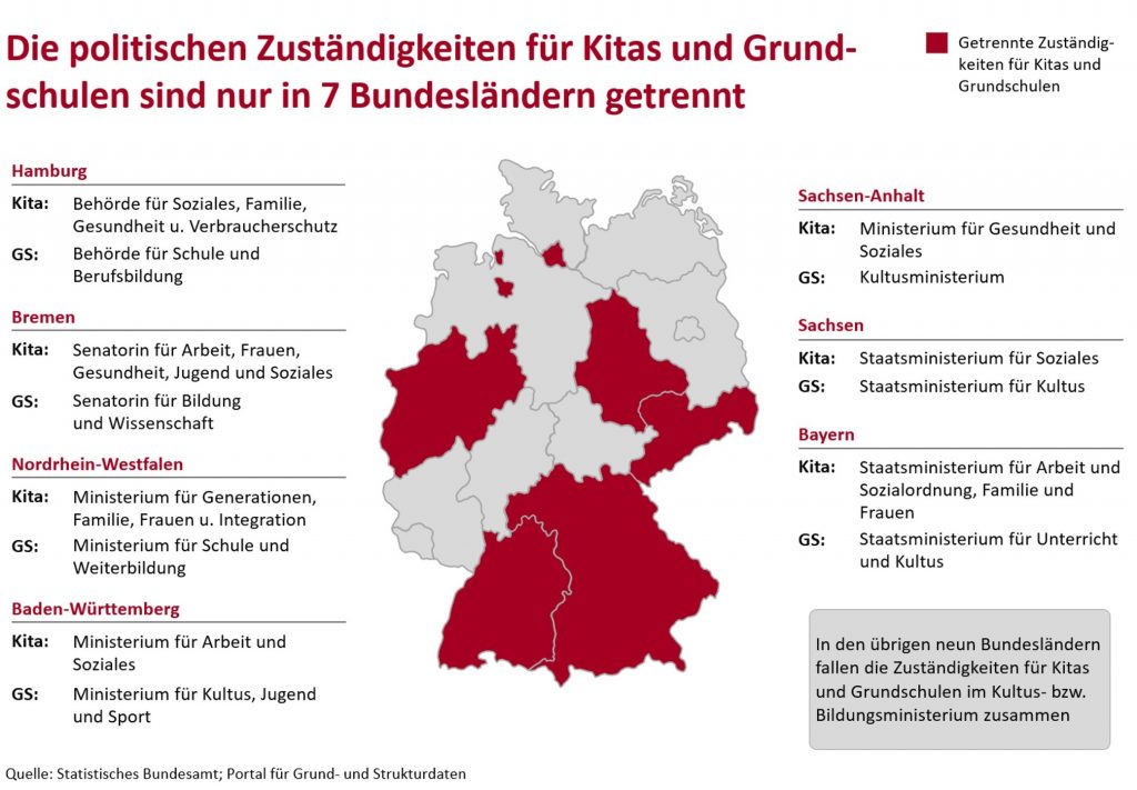
This one is almost good enough, if we just want a clear message and a matching chart. 7 Länder … ok.
But: The reader is being served some details here, and to access these is a little troublesome. Lines, repetitions and disruptive headlines create a restless atmosphere and hamper all attempts to collect which ministry is doing what, and where. Only in the center of the chart the reader’s eyes may have a little rest, but there is hardly any information to be found there. As well as in the text-filled grey box in the bottom right.
Task would be to make the slide more readable, e.g., by removing redundant items, maybe even by increasing the font size.
Less clutter, more structure
The first draft shows less complexity already, just because the boxes are gone. Instead, the red names indicate the beginning of a new block. They resonate well with the map, making those trivial grey map pointer lines unnecessary. Basic geography knowledge is the least you can expect from an audience (who look into Germany-specific topics).
Also, the slide doesn’t look that crammed anymore with a slightly smaller map. However, the map still seems too dominant for the mere 7 data points it represents. The repetitive category names and the footnote-ish grey box are further items to be fixed.
Keep it simple: A table
A simple table is nothing new, but it solves all our problems at once. Have the map on the left, ok, fine, and then use the slide to show those details.
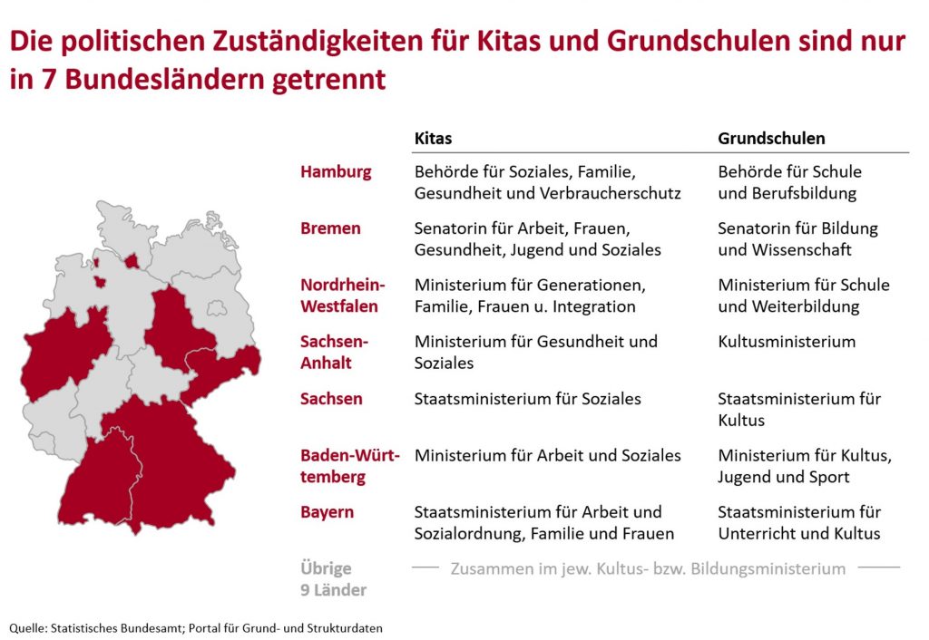
Readers can now find all the information in a list (in North-South order, while alphabetical would make sense, too). Within moments one can check what happens where, compare by Bundesland, by kindergarten and by school. That’s why tables are a good thing.
That grey box, excluding the remaining regions, has become a discrete comment.
Bottom line: Don’t make it complicated when it actually isn’t.