

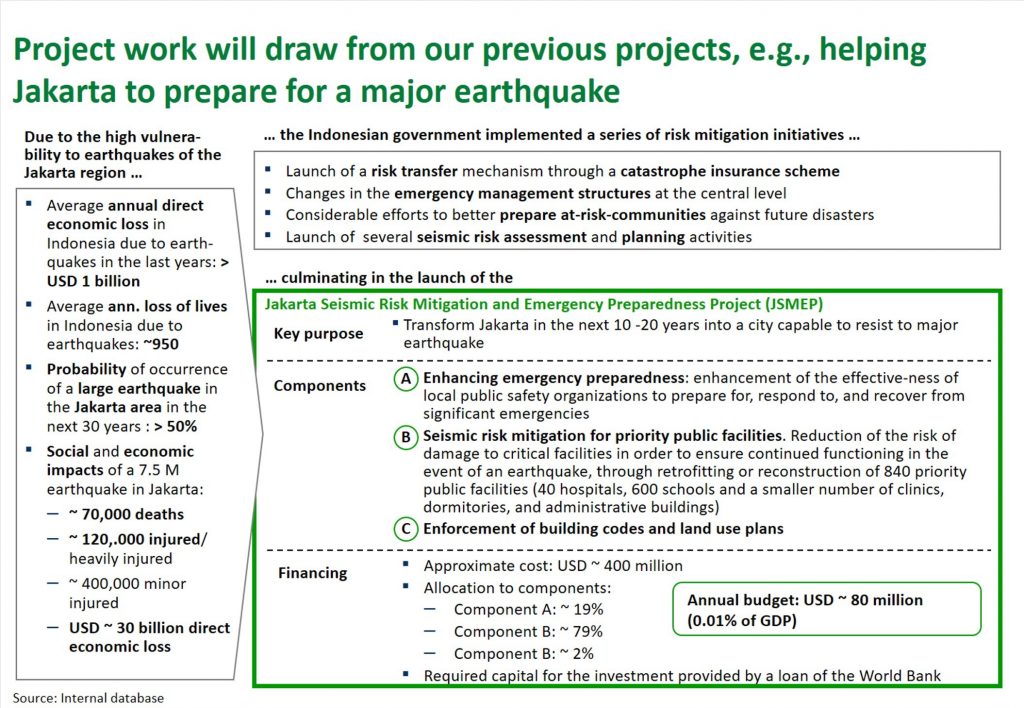
This chart is a difficult one to understand for several reasons. The first thing that puts us off is an unbearable plenitude of information, filling out the entire slide. Then, a lot of green items compete to be seen first. A small remainder of white space is still left on the page, making a few unevenly scattered holes.
As a result, anyone trying to read the slide will struggle to complete more than one or two bullet points without veering off to one of the green elements. Try it. And right when you start you will quickly find your attempt ruined by some complicated phrases (project name in the title, due to …). Nobody likes a chart like this.
So, what’s the task here? We need a clear title “We have specific experience for this project” and a chart that presents this experience in a digestible fashion.
Less excitement through less color
Minimal changes do some help already. This half-way draft has an adjusted title and, most obviously, reduced color. The title makes a specific point now. The chart design reflects that point with a clear focus on the Jakarta project.
Graphically, the green frame is a very discrete accent, though, and this allows us to read all the derivation text, too, without getting distracted.
Readability through white space
Finally, we further increase the readability of the text by using the same line spacing across the page, by standardized hierarchy and grammar and by using less bold text. The remaining white space is evenly distributed now and generates a harmonious first impression of the slide.
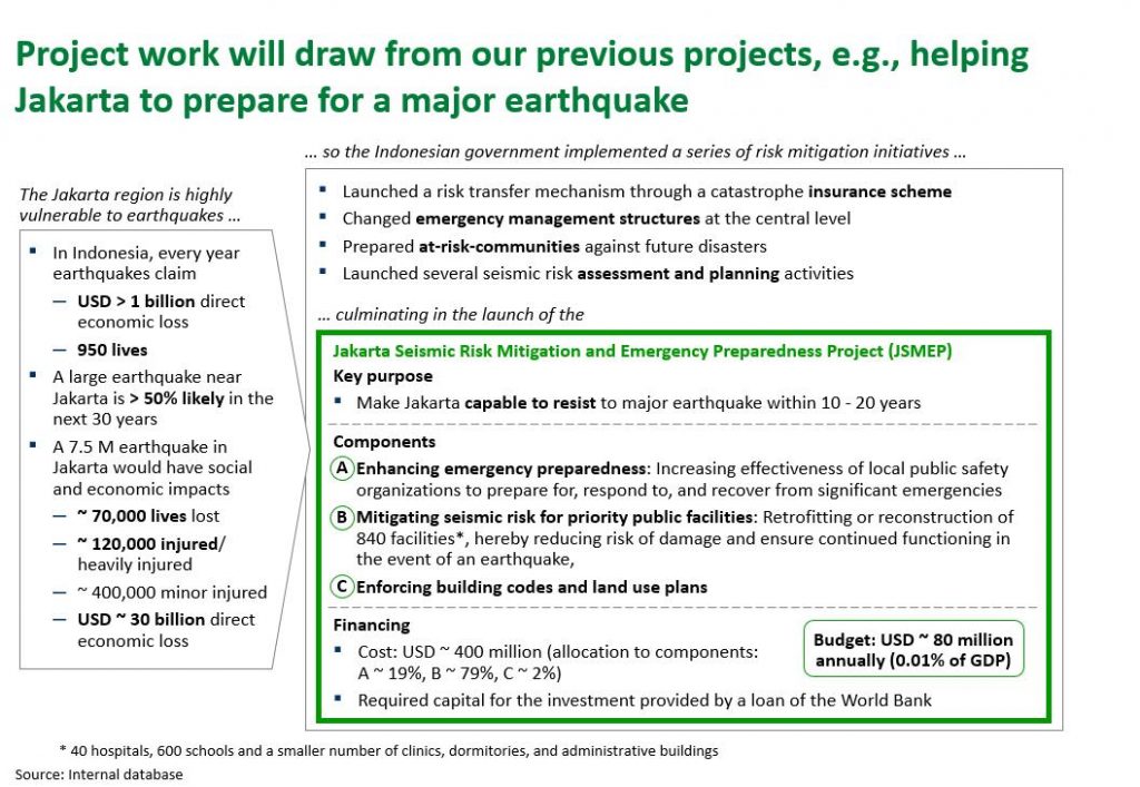
Moreover, we simplify the layout into a simple two-part one: LEFT (earthquake vulnerability) leads to RIGHT (development of protective measures). The two boxes on the right become one. This makes the green Jakarta project visually an item on the list of counter measures, which it actually is.
As a result, we have a reasonably understandable chart. There is still a lot of information in it, but the reader has a chance to take it in. Even on a hasty way from the title to the green Jakarta box one gets served the important information – lives, dollars, emergency, planning – that outlines the context for the project.